The 2025 John Wick Franchise Packaging Style Guide

The work began a few years prior to the packaging guide with a logo study. The objective was two fold - could the John Wick logo be locked up with a character icon and can we create a unified design for all chapters?


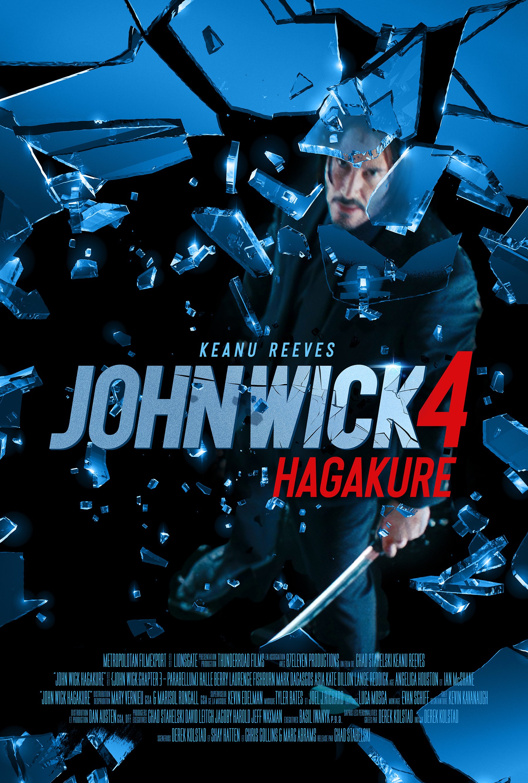
The introduction of a character icon was interesting. It does bring a “Bond” feel to the logo but this is John Wick and we want to maintain its own look. The gun is very iconic to the John Wick character. In the end it was decided that a bold typographic sans graphic look was best for the property. Below the type logo was placed into previous theatrical branding posters to test its ability to create a through line in the design and applications.
The logo below was selected for The 2025 franchise packaging style guide application. The logo has baseline and stacked varients.


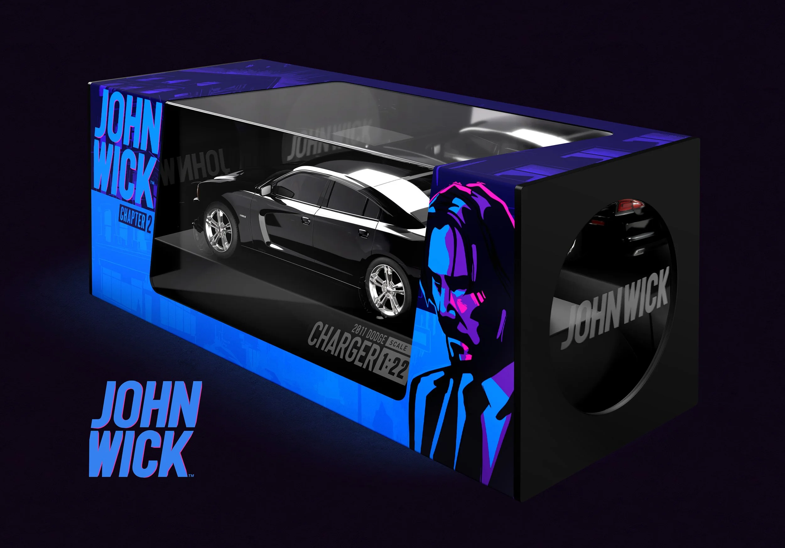
Each of the John Wick chapters is known for its dramatic color schemes. The creative direction for the packaging trade dress was to bring that dramatic colorway to the forefront.


The guide offers option such as options with and without character art. Additionally there are examples that push the structure design of the blister card packaging. From a straight forward utilitarian design to a more bespoke custom iteration.

We love designing packaging there is no better way to say it. Having the opportunity to put our passion into such a fantastic property is a perfect storm in the best possible way. Thank you for taking a look!