

The Masters of the Universe Theatrical Logo Design
In 2019 Mattel asked to begin work on a refresh of their classic Masters of the Universe logo for the Sony movie in development. The ask was to capture the power of the original ‘80’s design while giving the new logo a modern appeal. It was an honor to start work and to be entrusted with the responsibility. The work continued for the next six months and included brand extensions such as MOTU Revelation and HE-MAN. The production of the film was put on hold along with the films new logo. Now six years later we are excited to see its debut on the big screen!

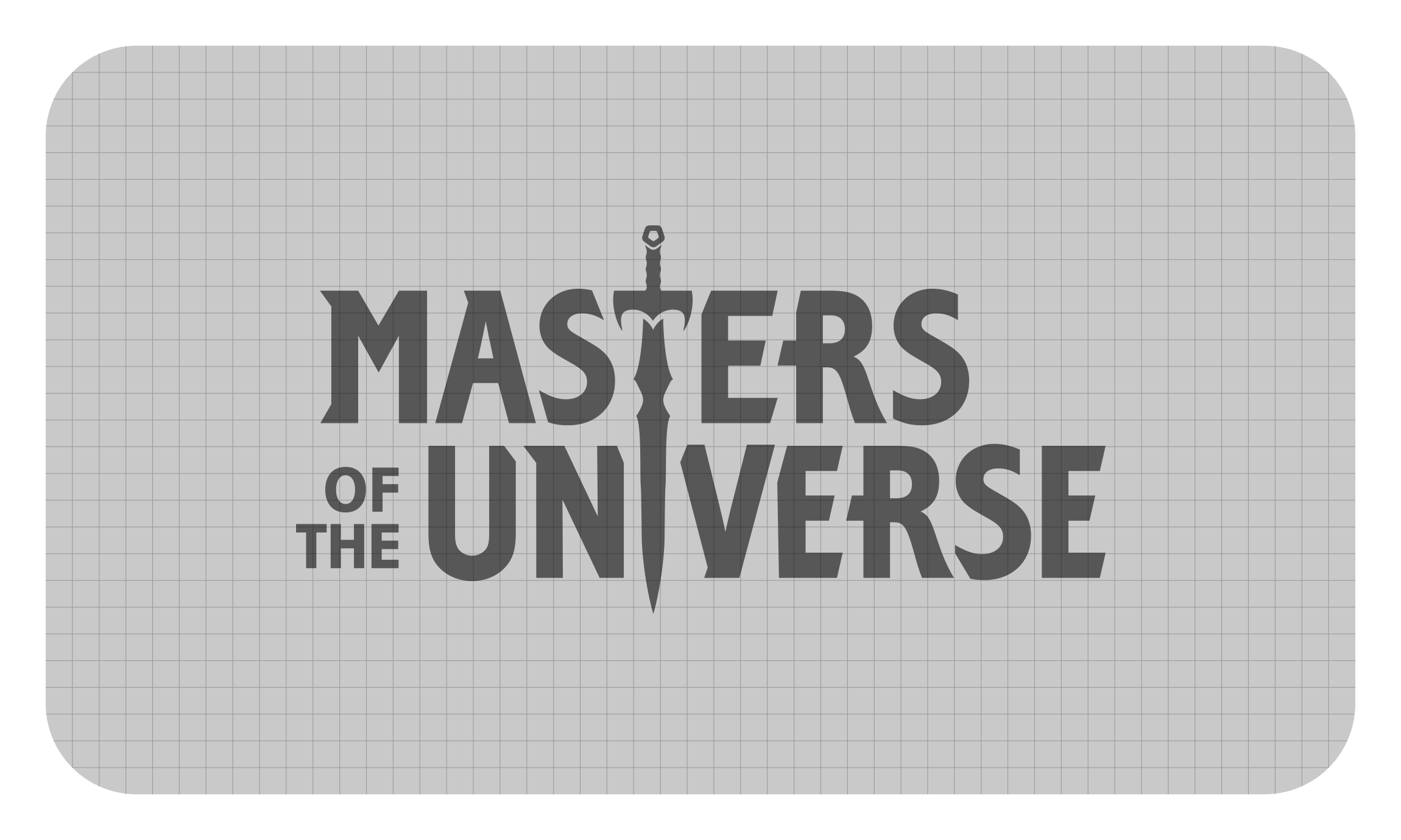
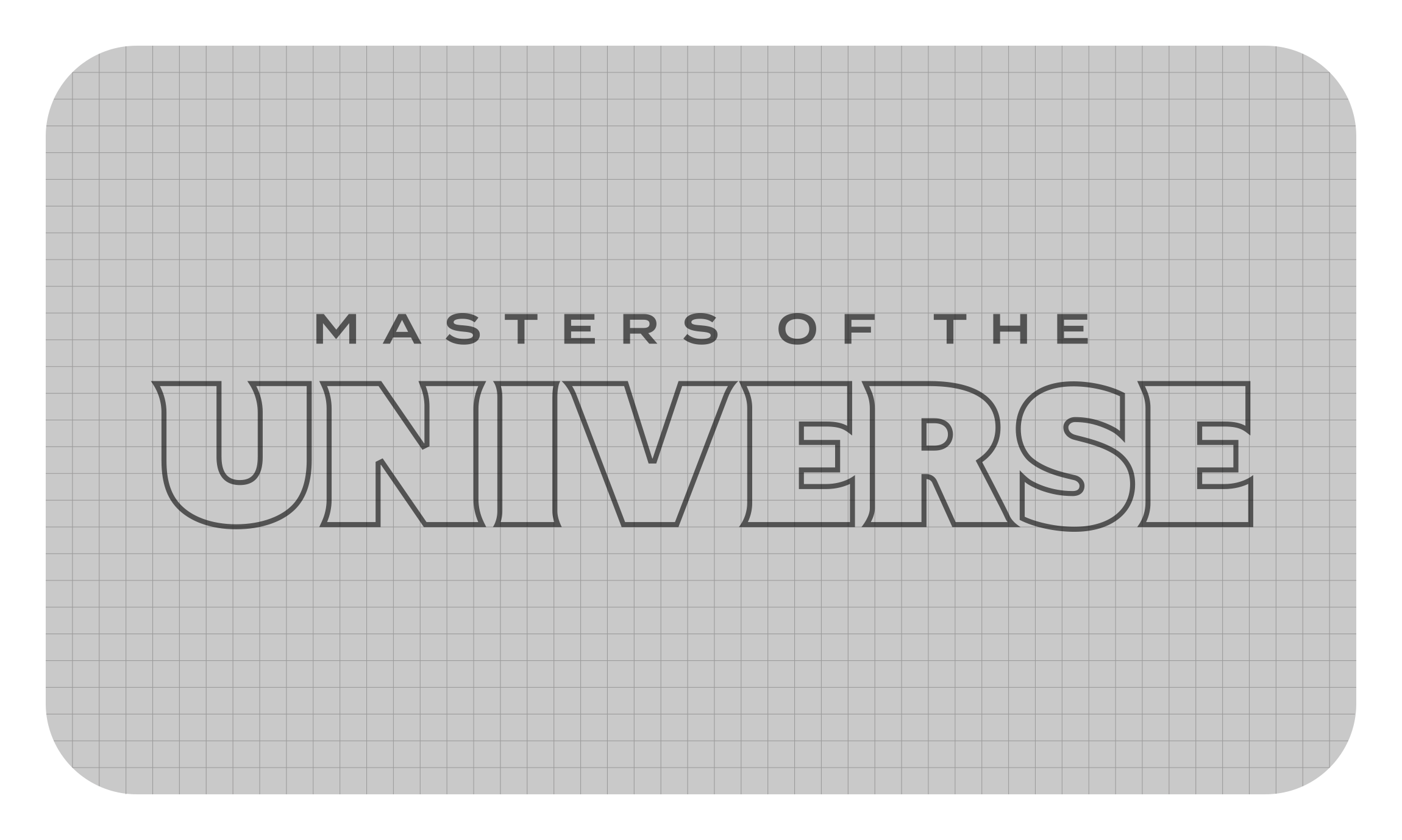
Shown here are graphic sketches that were created during the initial and final stages of the logo development. Classic more illustrative explorations included the sword. Eventually custom letterforms were settled upon as the foundation of the mark.
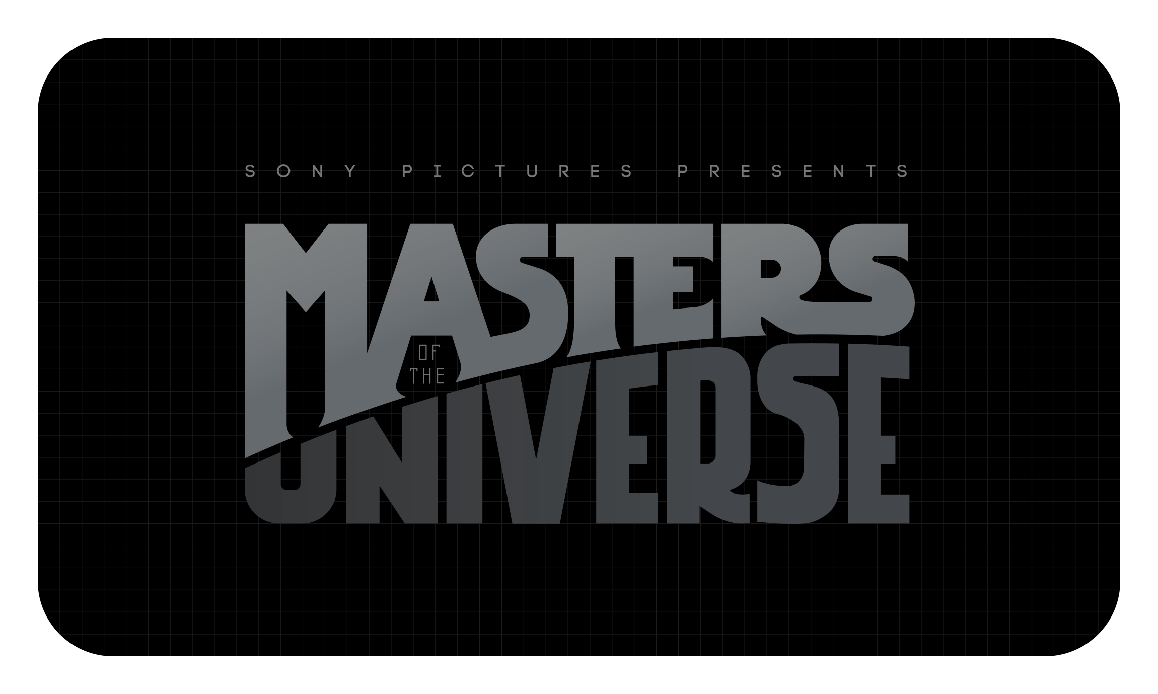
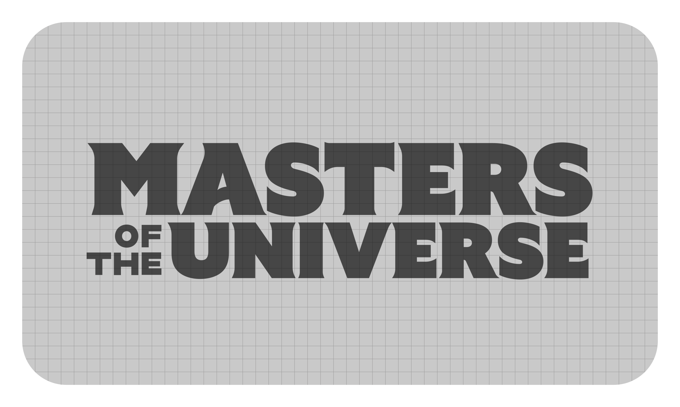
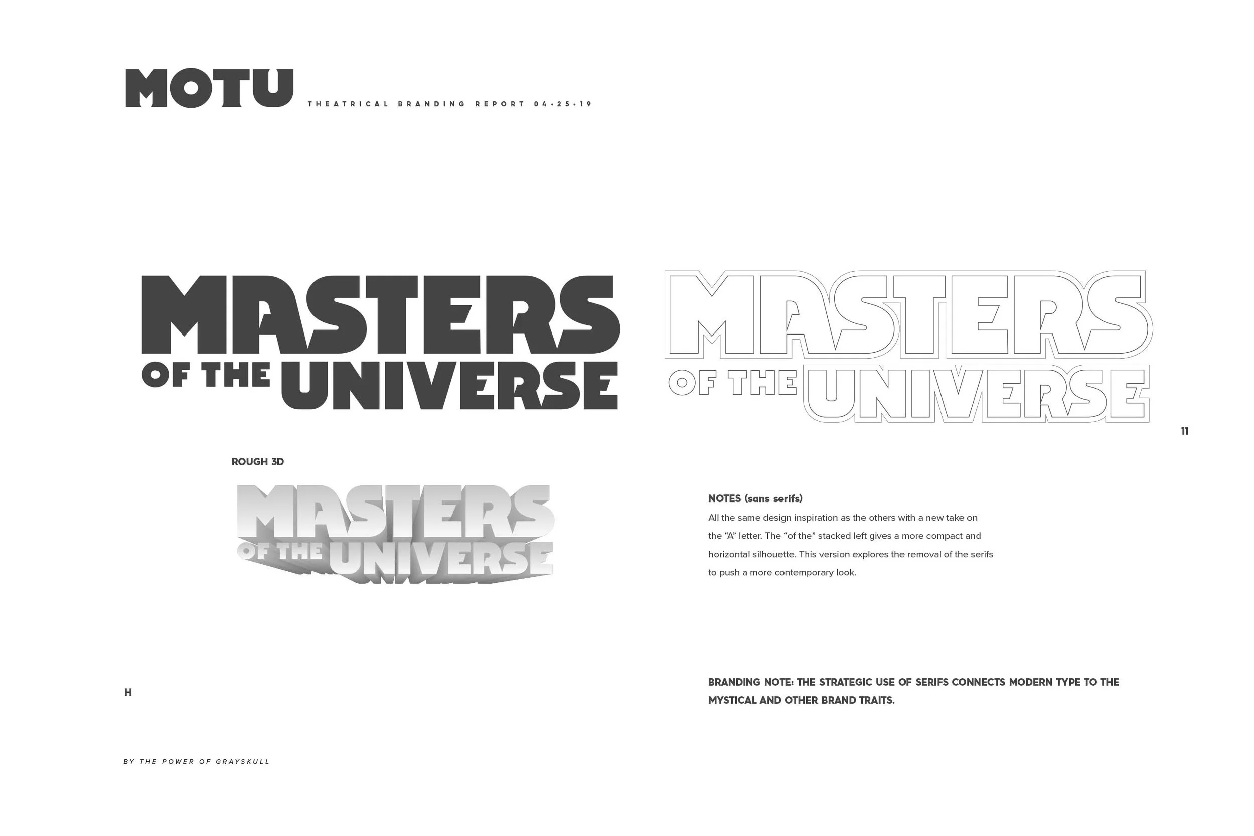
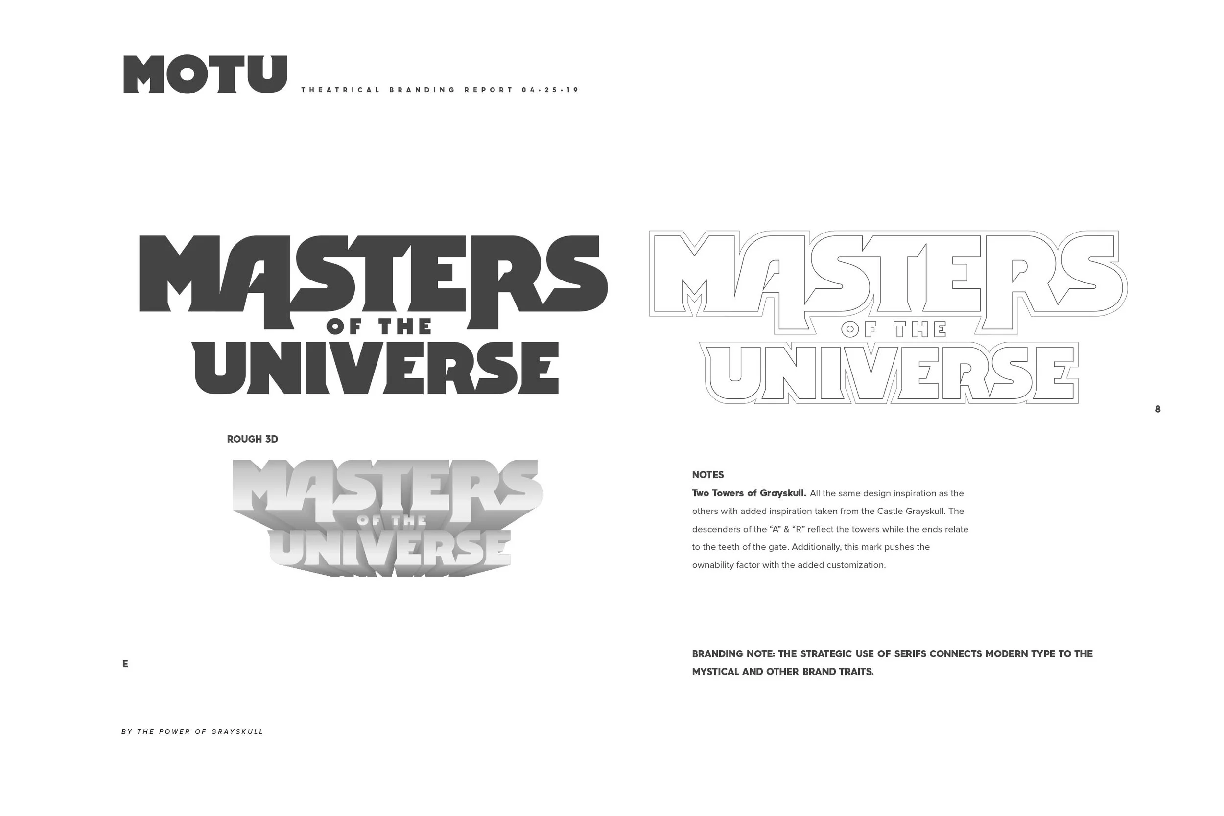
The inspiration for the extended “A” and “R” descenders came directly from the two turrets of Castle Grayskull. The “A” was inverted to create a sense of symmetry between those two letters.

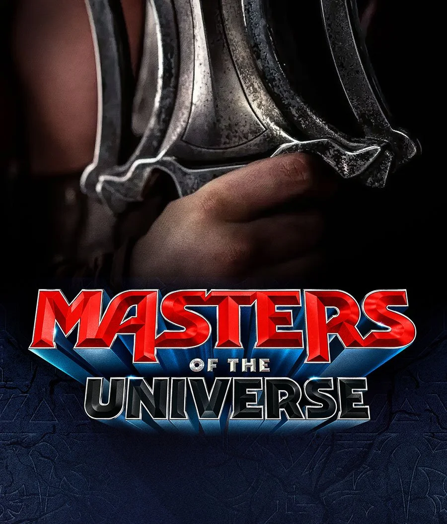
With the final letter forms approved we moved onto test renders. We explored many color schemes and textures with a cinematic take.

Thank You for the Visit!
Make sure you see the logo make its big debut this June! Logo design is the heart of many branding campaigns and we love to see a great brand launch! This is a very exiting relaunch of this powerful franchise.
