


Packaging Through the Fog
April, 2020, in Burbank California, we launched our design company during the COVID shutdown. Focused on building a fresh portfolio, we set out to pitch packaging design for the DC Justice League Dark line.
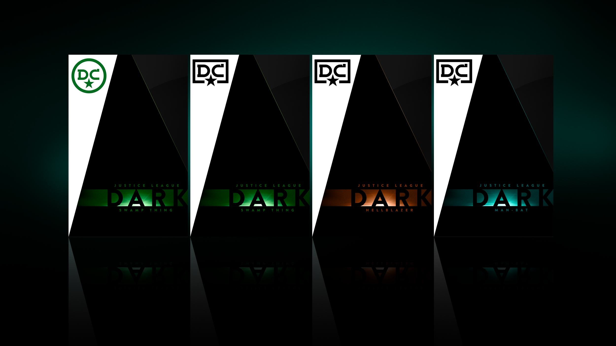
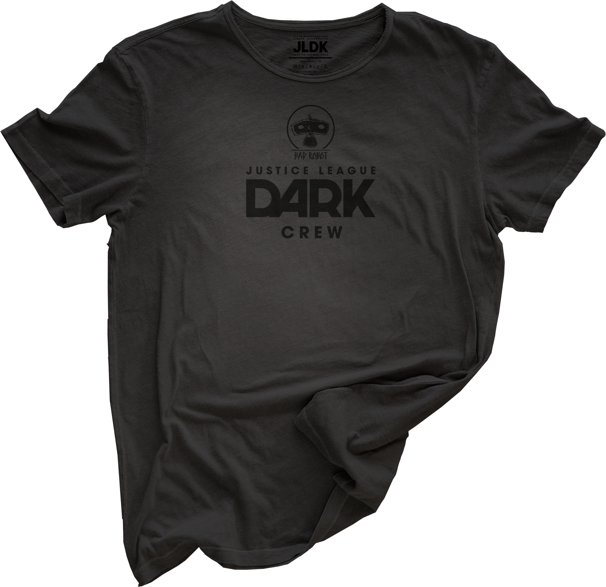
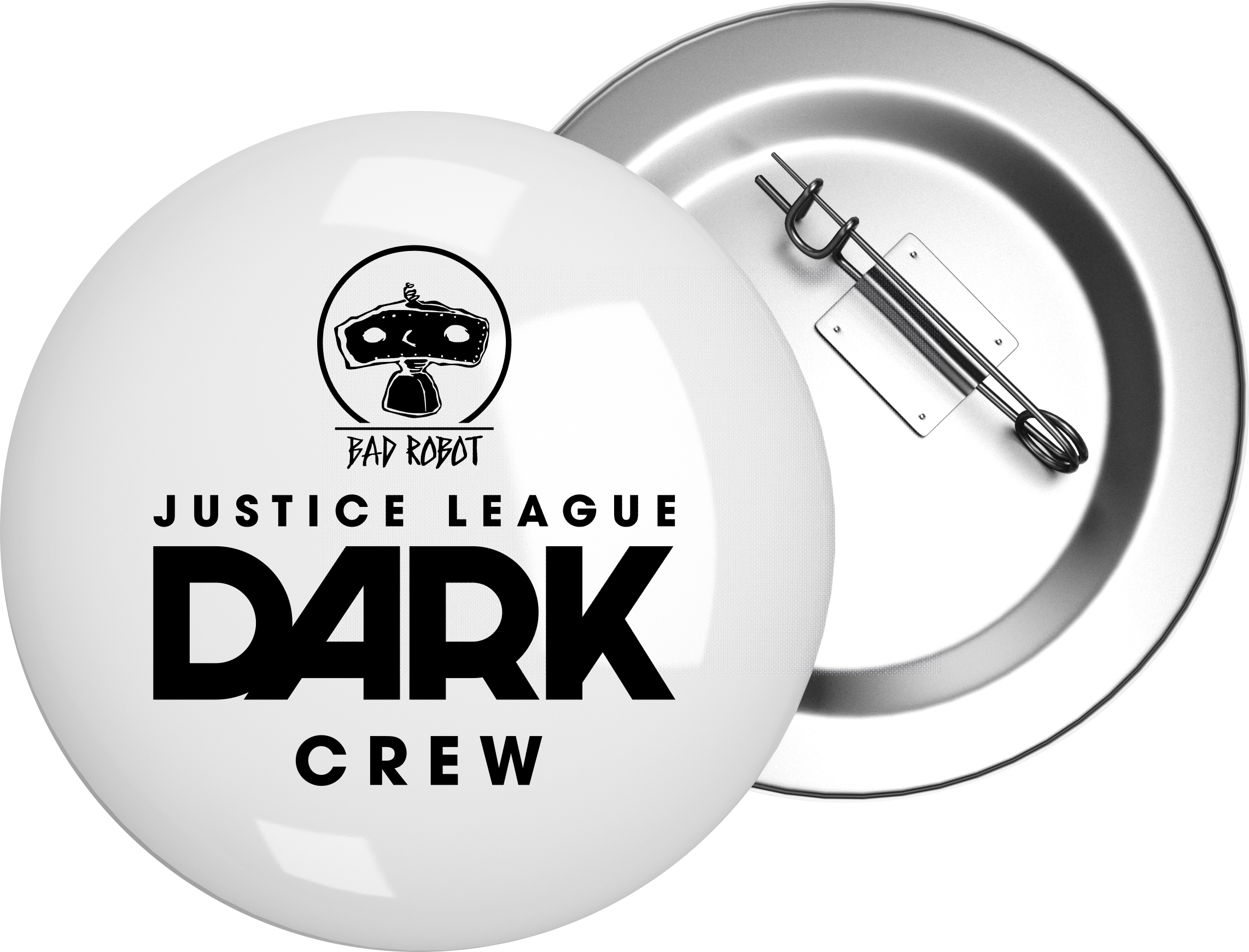
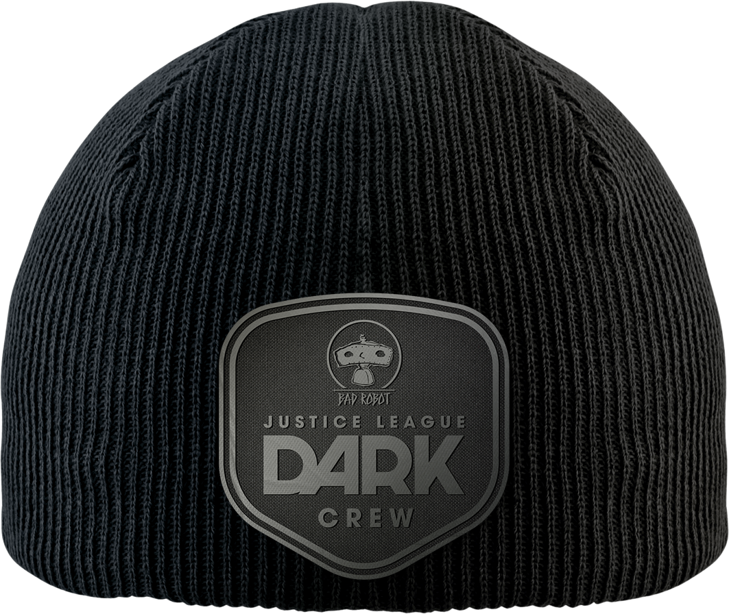
At the same time, we explored new marks for Justice League Dark and DC. It was important to create a new mark for JL DARK, bringing in updated colors and effects. Although the DC mark wasn’t part of our original plan, we decided to include it to refresh the concept.
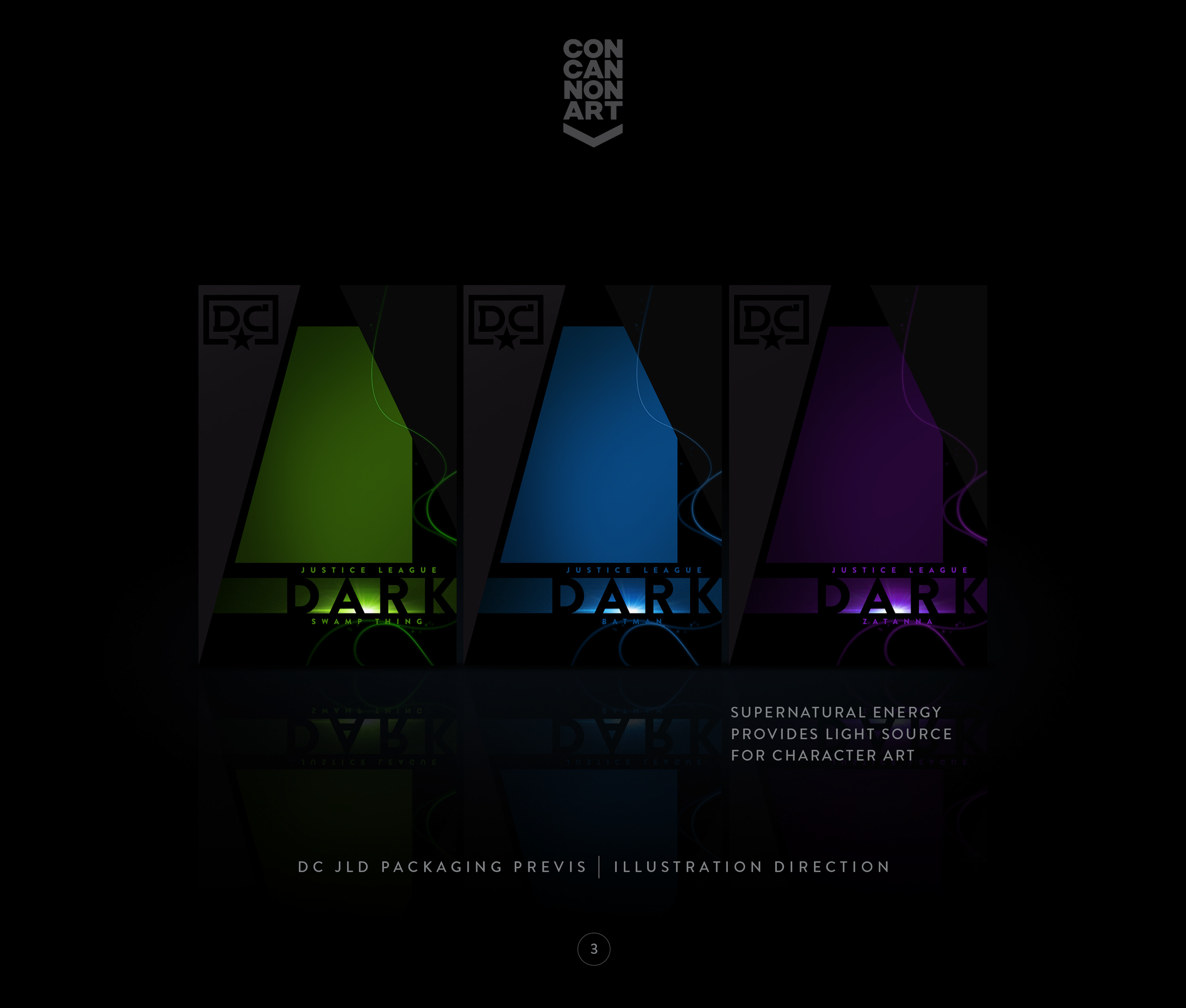


Our designs usually draw from storylines from movie scripts, as we find that narratives help shape packaging features. For this pitch, we created a concept story about a fictional energy that the characters were mastering, which became a unifying theme throughout the packaging.

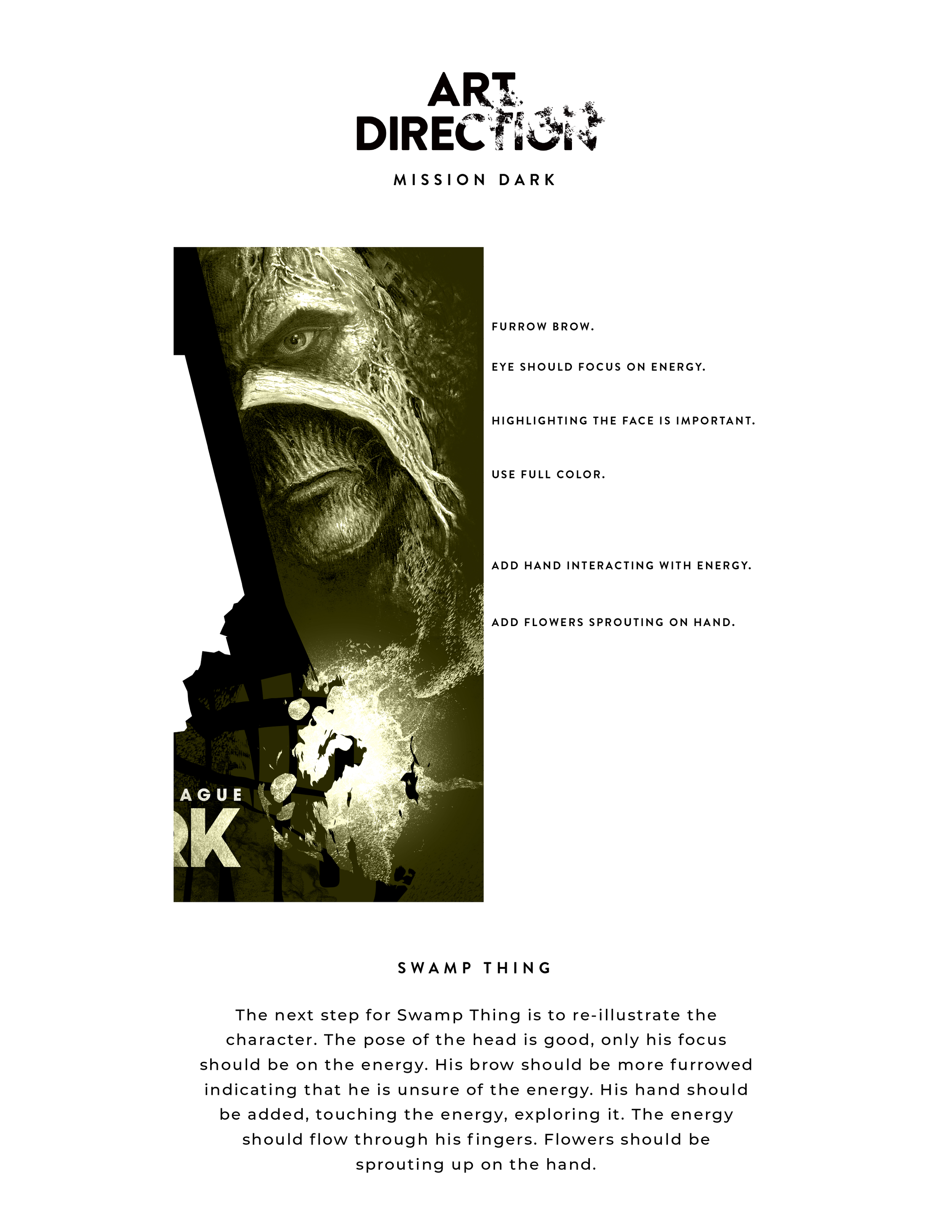
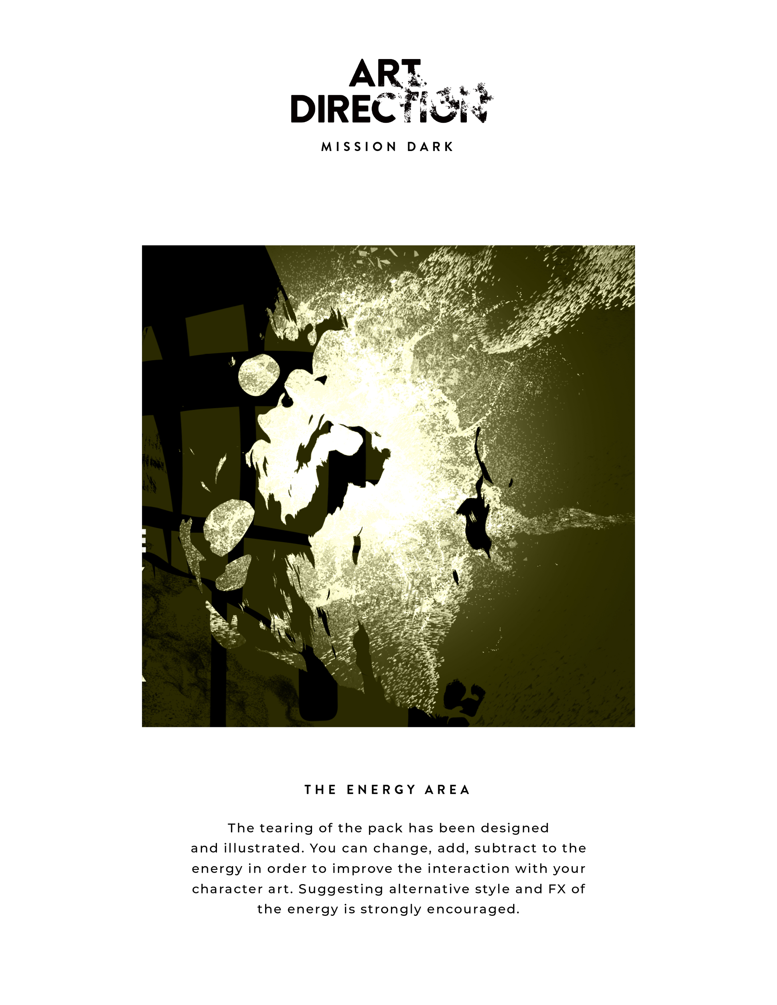
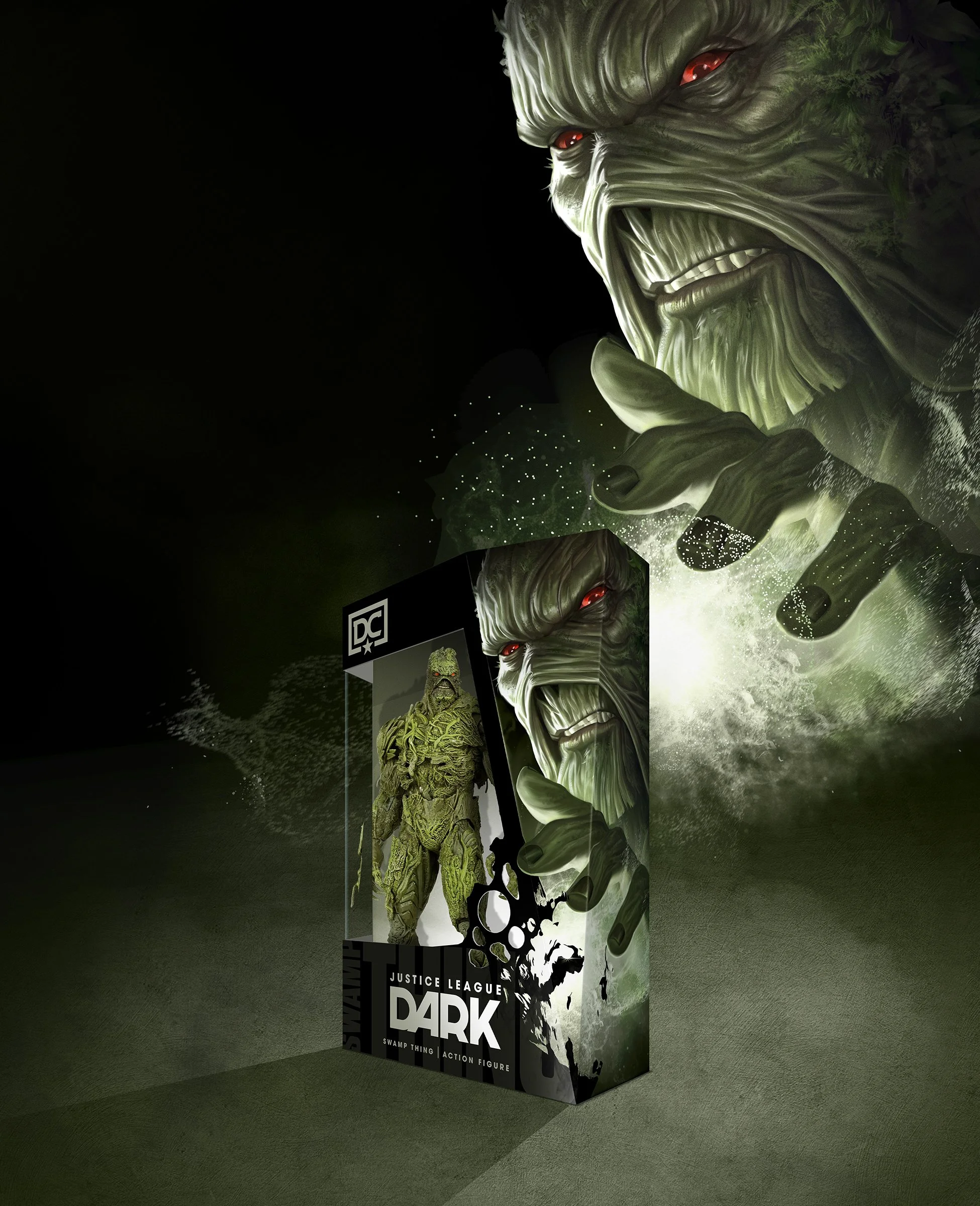
We created custom illustrations to replace the inspiration FPO art featuring Zatanna and Swamp Thing. We also refined the style and effects of the energy.


We designed a hanging window box and created die lines for the pitch presentation. While working with the sketch artist, we developed additional art to demonstrate licensing potential, including sketches for soft goods, hard goods, signage, and labels.


Once the character sketches were integrated into the packaging layouts, we moved on to digital art for the final character illustrations. We replaced the placeholder art and added the new designs to our merchandising banners, completing the pitch materials.


We didn’t know when the fog of COVID would lift, and it would be nine months—almost a year—before we could meet clients in person. Thank you for spending some time with us and reviewing our design process.
